Hi-Fidelity Redesign for an International Student Conference Site
Nexora designed a homepage demo and scoped an eight-screen hi-fidelity redesign for an international student conference website, with the registration journey carrying the most design weight.
Hi-Fidelity Redesign for an International Student Conference Site
Kết quả
The Challenge
A conference organiser’s website has to answer three questions fast: is this credible, what happens over the event days, and how do I register. The existing experience needed to carry awards, partner endorsements, a day-by-day agenda, media coverage and alumni stories without burying the registration path. Prospective delegates, and often their parents or teachers, decide in a few minutes.

The Homepage Demo
The demo shows how one long page can run in a clear order. A hero introduces the conference, followed by council cards with seat counts and agenda topics, then recognition and awards, partner and endorsement logos, and a four-day rundown from arrival to closing. A five-step registration track follows, from application to conference week, and then media coverage, alumni stories and a help-centre FAQ before a final call to action.
The Conference Journey
Within the proposed scope, the path from conference listing to conference detail to registration call to action carries the most design weight, because it is the route most participants take. Listing cards support upcoming and past conferences with filters. The detail page covers dates and location, committees, agenda and registration.
Proposed Scope
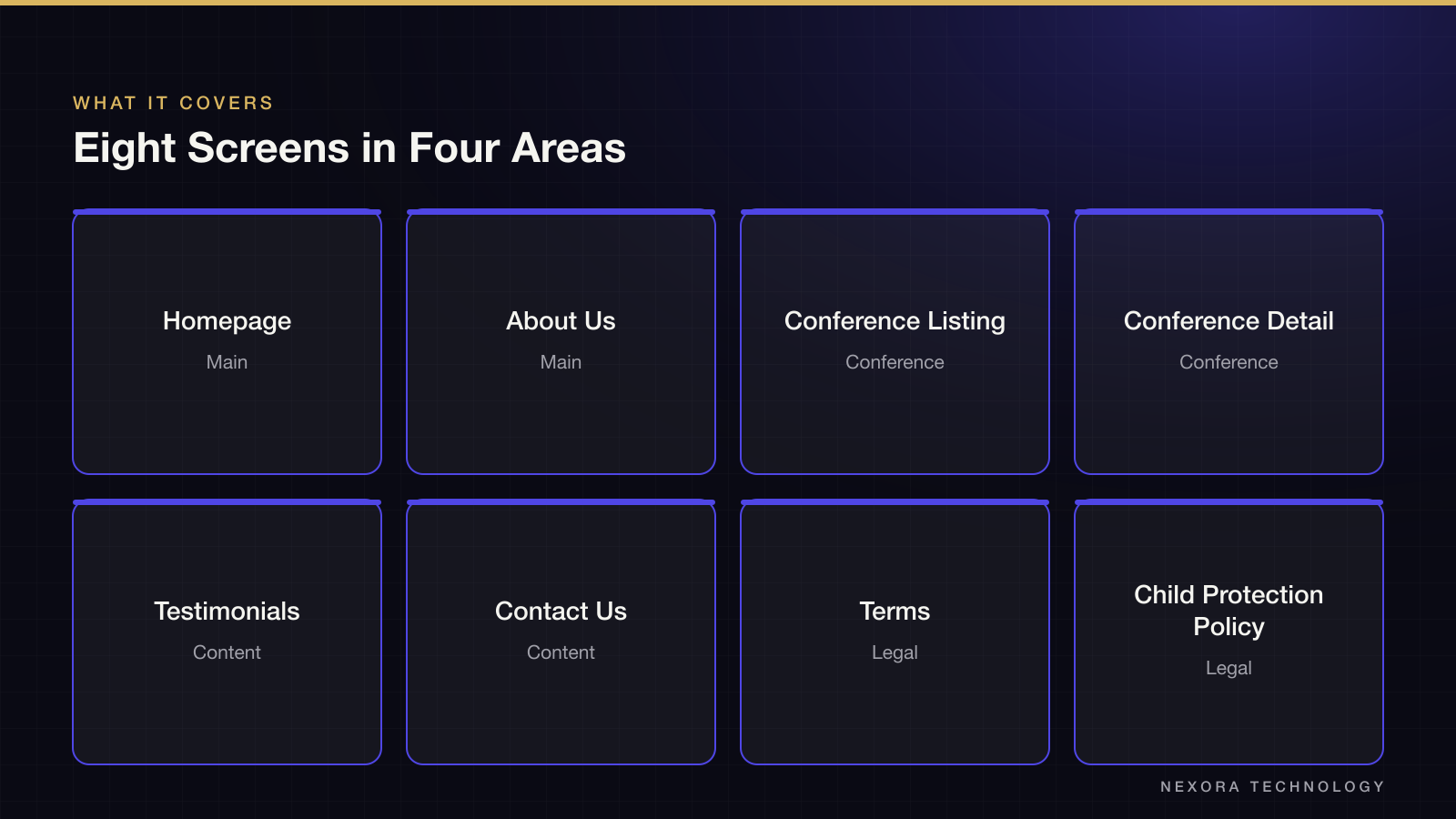
The proposal covers eight screens in four functional areas, each designed for desktop and mobile. The handoff is a structured Figma file that a development team can implement directly.
- Main: homepage and About Us
- Conference: listing and detail pages
- Content: testimonials and Contact Us
- Legal: terms and a child protection policy, as long-form reading layouts
Deliverables
Hi-fidelity means production-ready screens, not wireframes: real typography, spacing and colour decisions, component states and design tokens. The Figma file uses organised layers and named components, and comes with a condensed style guide for developers. Design direction is locked at the homepage, so later screens build on one agreed look.
Deliberately Out of Scope
The proposal excludes front-end and back-end development, CMS integration, copywriting, photography, logo and brand identity work, custom illustration, user testing and admin screens. It asks the client to confirm existing brand assets, reference sites for the intended tone and whether a CMS will manage conference content later, since that changes how components are built.
Bạn có một dự án tương tự?
Kể cho chúng tôi nghe. Cuộc tư vấn đầu tiên miễn phí.