
The Challenge
A packaged-food maker that sells through distributors has a catalogue of everyday products with small price tags: egg noodles, pasta shapes, dried and fresh rice noodles, rice paper. Selling these direct to households means the store must make a basket of several low-priced items feel worth the delivery fee, and it must also carry the company’s story, because a shopper who does not know the brand needs a reason to trust it. Nexora took on both parts: the shop and the brand pages.
What Nexora Designed
The work started with a sitemap and low-fidelity wireframes for every page, then moved to the full visual design. Nexora designed the shop and the brand pages as one site, not as a shop with a story page attached.
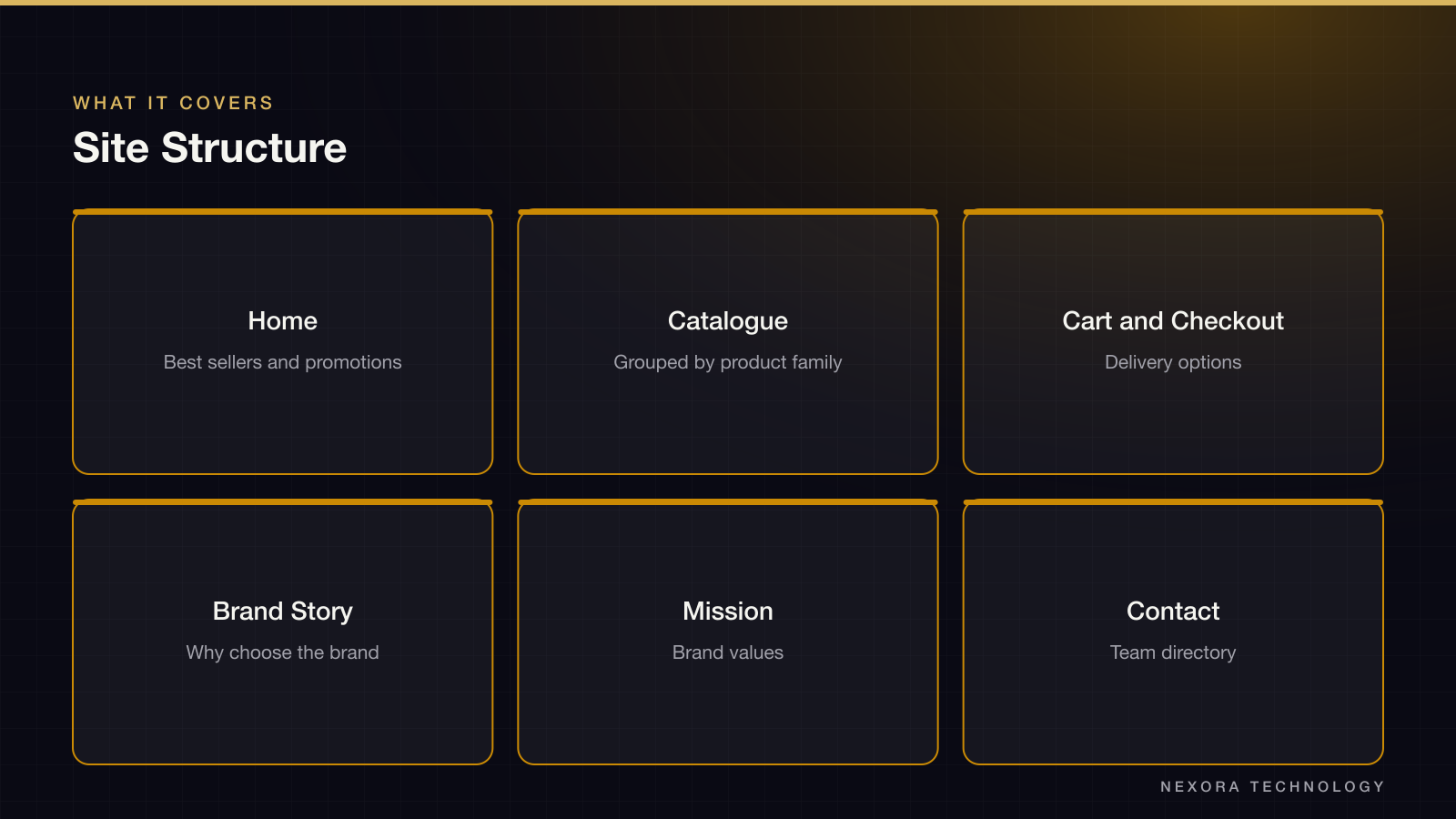
- Home with a banner, best sellers, product of the month and a discounts block
- Catalogue grouped by product family: noodles, rice paper, dried rice noodles, pasta and fresh noodles
- Cart, checkout and delivery selection
- Brand pages: story, why choose the brand, and the mission
- Contact page with a sales and marketing team directory, and a footer carrying policies
Key Decisions
The home page opens with products, not the brand story. The brand pages sit one click away in the main menu, so a returning buyer is never made to scroll past them. Home shows three product shelves: featured, new and on promotion. Each product is a card with a photo, a pack size and a price per pack, which lets a shopper compare a 200 g and a 500 g pack without opening either. The catalogue page repeats the same card in four rows by product family, each ending in a See more link, so the shelf stays short but the full range is one click away.
Cart, Shipping and Payment
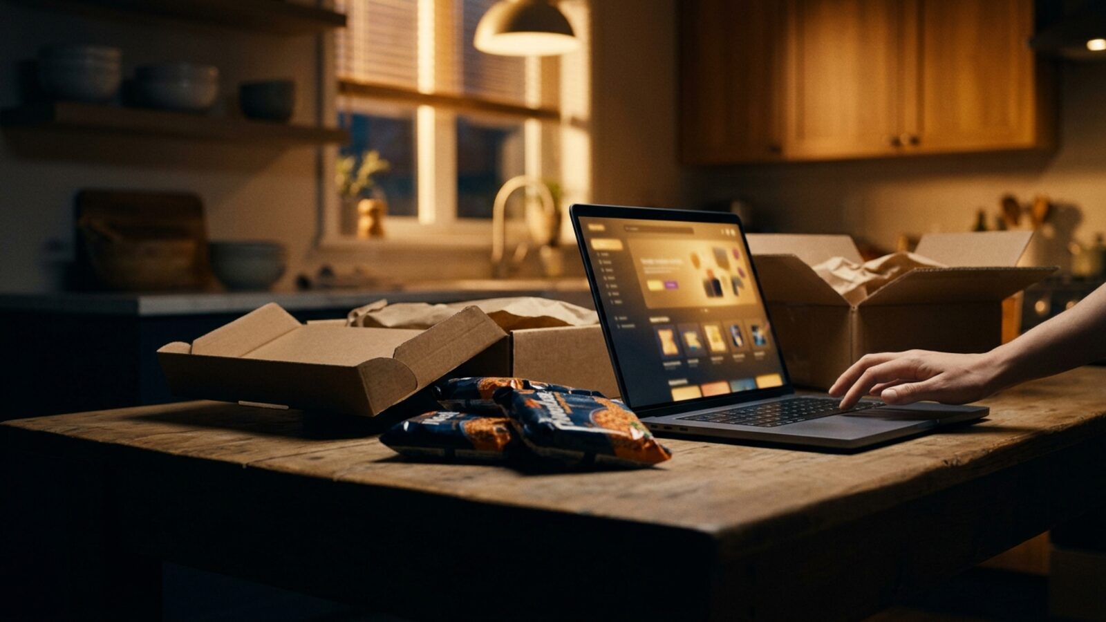
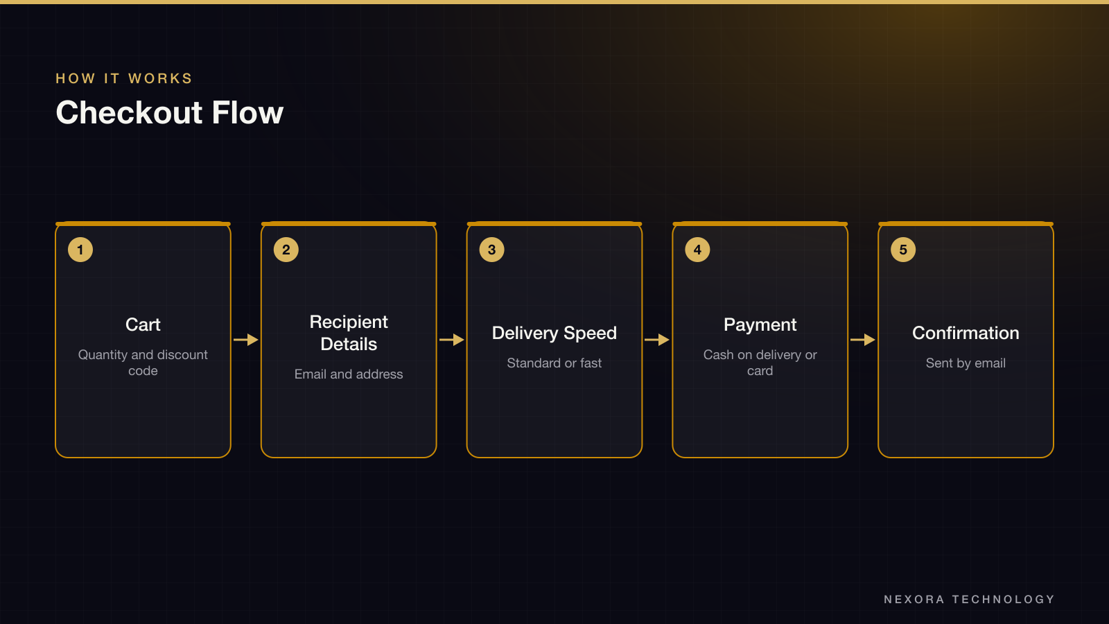
The cart shows each line with unit price, quantity and line total, then a subtotal with a discount-code field. Checkout keeps the order summary visible while the buyer fills in recipient details, so the delivery fee is added to the total in front of them before they pay. Nexora designed two delivery speeds, standard and fast, each with a fee and an estimated arrival window, so a shopper who needs noodles for the weekend can choose to pay for speed. Payment offers cash on delivery or a bank card. The thank-you state confirms by email.
The Visual System
The system is small on purpose. One heading style, one title, one subtitle and two body sizes cover all text. A warm gold fills the primary button and the favourite mark; a grey outline serves secondary actions. A single linear icon set of shopping symbols, with filled and empty states for the favourite and the checkbox, is used across the site. A quantity stepper, input fields and date pickers are designed once and reused in the cart, checkout and contact pages.
What the Client Gets
The client gets a sitemap, wireframes, 19 artboards and a component sheet. A front-end team can read the checkout states and the delivery options off the artboards without asking. This was a design delivery; the source material does not record a launch or sales results, so none are claimed here.