
The Challenge
A small resort sells on two things at once: the feel of the place and the practical facts of a stay. Guests want to see the garden and the pool before they book, but they also need room size, bed layout, how many people fit and what a night costs. The resort lists on travel platforms too, so its own site has to give a reason to book direct: clearer rooms, honest photos and the surroundings in one place. Nexora designed the site from first sketch to visual design.
From Moodboard to Wireframe to Screens
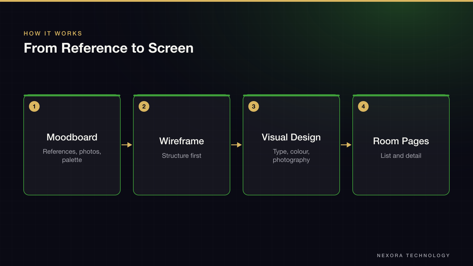
The work began with a moodboard. Nexora collected hospitality sites with calm layouts, then paired them with the resort’s own garden and balcony photos and a palette of black, fresh green and white taken from the logo. A wireframe came next: a rooms strip, an introduction with a photo block and a location section with an island map. High-fidelity pages followed, so the structure was settled before the colour and type were applied.
What Nexora Designed
The design covers the whole guest path, from first impression to booking:
- Home: hero, room highlights, introduction, resort location and room choices
- Rooms page: six room types, each with an overview line, a Details button and a room-map button
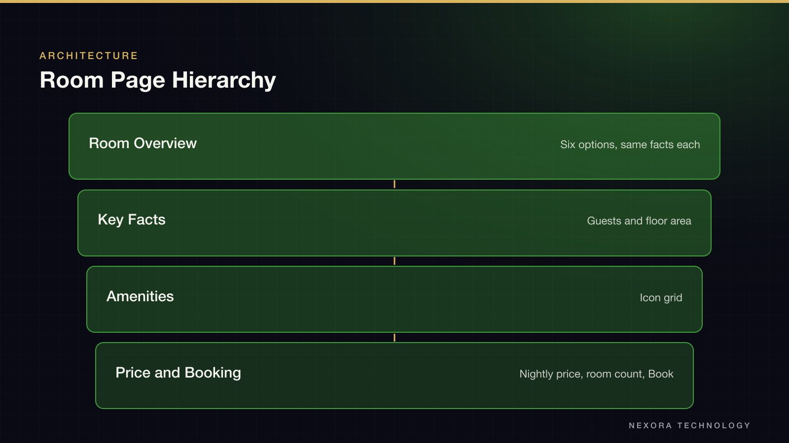
- Room detail page: photo gallery, maximum guests, floor area, bed layout, amenity icons, nightly price, number-of-rooms control and Book button
- About page on the design style, the garden and the pool
- Navigation and footer for rooms, about, tour services, contact, and rules and notices, with links to the resort’s social and travel-platform pages
Key Decisions
The rooms page alternates photo and text from left to right, one room per row, so each room gets its own block while the page still feels varied. Every row follows the same pattern: option number out of six, room name, area, beds and a from-price per night. A guest can compare rooms by scrolling and reading the same facts in the same place. Each row carries two actions, a filled button for details and an outlined button for the room map, so the primary and secondary paths are visually distinct. The detail page puts the facts that drive the decision, maximum guests and area, in large type next to the photo, with amenities as an icon grid below.
Location and Surroundings
The introduction section pairs a short welcome with a list of nearby places and their distances, including night markets, a beach within walking distance, a local liquor workshop and a longer drive to another beach. An illustrated island map marks the resort and the sights so a first-time visitor understands where the resort sits on the island. All rooms share the same feature line: a kitchen, a BBQ service and a balcony with a view of either the pool or the garden.
The Visual System
A warm cream page, a pale green band behind the room listings and a deep green footer tie the site to the garden. Three typefaces are specified: a rounded sans for the main heading, a serif for titles and a clean sans for the menu, prices and body text, with sizes set for each level and a green button style. Layered, white-bordered photographs give the pages a printed-album feel.
What the Client Gets
The client gets a moodboard, a wireframe, six room-listing layouts, a room detail template and a defined design system. Section names for tour services and rules are in the navigation; their pages are not in the source files, so they are not described here. This was a design delivery with no recorded launch.